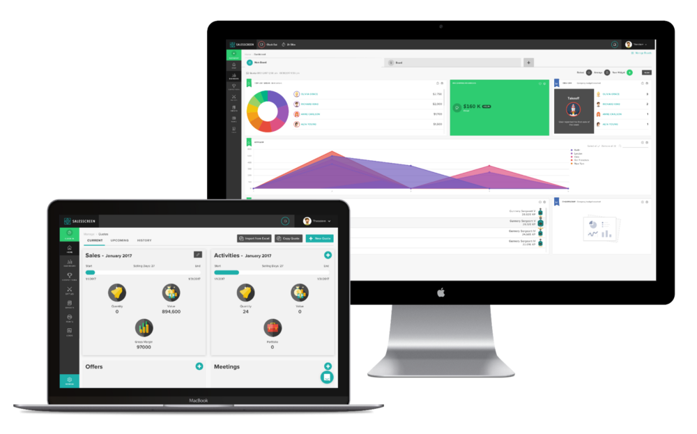
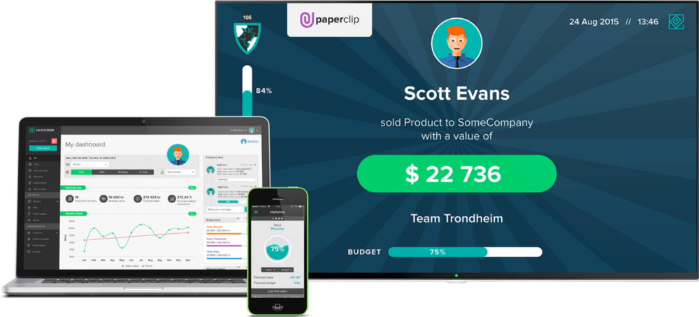
Our entire data visualization dashboard has been completely redesigned based on customer feedback. It’s now even easier to see, understand and act on your sales data.
The SalesScreen dashboard is like the central data hub for understanding KPIs, performance on quota, metrics and all of your other sales data. It’s no wonder then that our team takes great pride in how we present this to our users. To that end, the old dashboard has just had a complete face-lift.
Here is a quick overview of the major changes:
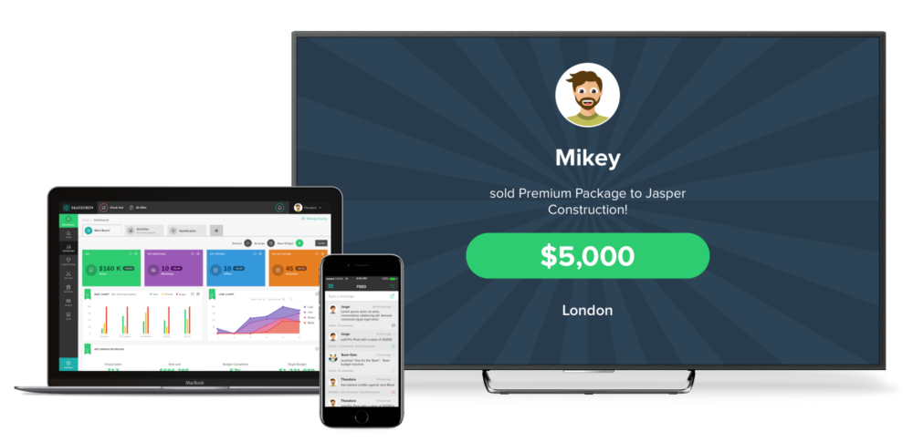
- The dashboard has a whole new look that is much more colorful and stylish.
- It is now even easier to understand the data at a glance or in-depth.
- The look, feel, design and function of the new dashboard can be completely customized by administrators.
The new dashboard is much more flexible, allowing administrators to completely choose the size, display type, and types of data shown. Before, data could only be displayed in a few different ways. Now, the data can be displayed in tons of different styles, colors, and themes.
In addition, administrators can create several different boards, each with their own tab, in order to show specific data for certain teams or assignments, for example. Administrators now also have the power to limit who can view different boards by blocking or adding individual teams to each board.
The major benefit of this new feature is that it helps sales reps, managers and company executives to more quickly and more effectively view and understand their data.
Check it out!
OLD
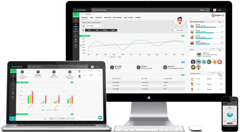
NEW
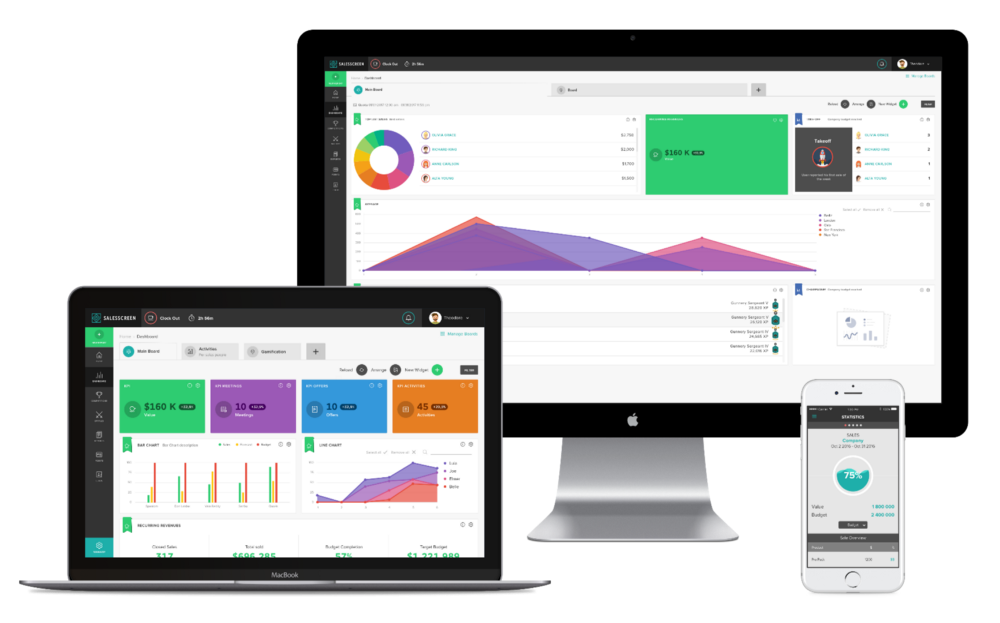
OLD
NEW
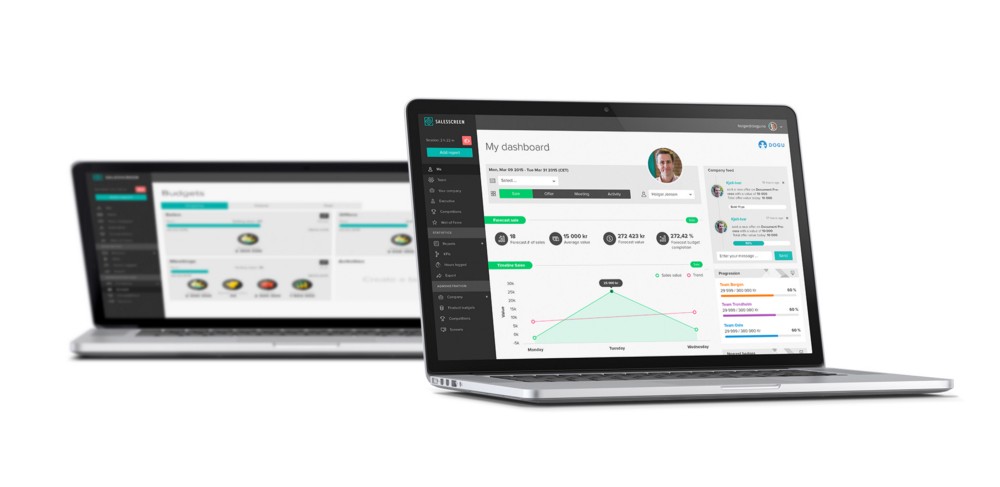
OLD
NEW
We’re always working on improving the product, improving user experience and adding new features. So, be sure to stick around for more updates and subscribe to our newsletter to see what else is going on behind the scenes.


